with 700+ prebuilt websites
Try the Free Demo Why Be is so fast?

Build ANY type of website in no time. For every client. Anytime.
Ever since Betheme was just an idea, we knew that it would be different from all other multipurpose WordPress themes we’d tried before.
We wanted to build something more than just another WordPress theme, that could easily adapt to any project you need to work on without writing any code. A theme designed from scratch to save your time & help you enjoy your freedom...
Read more


Extensive and constantly growing library of Video Tutorials in 1080p HD with US native speaker. Easy to understand for both beginners and professionals.
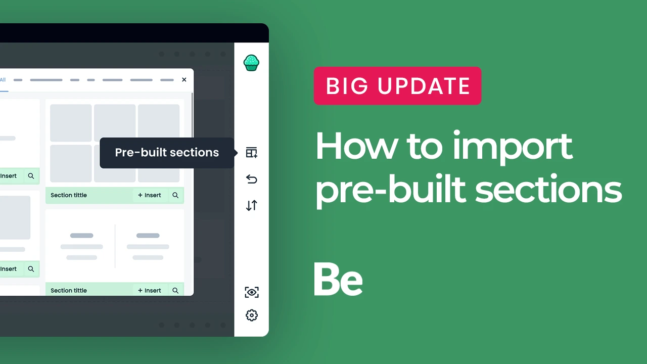
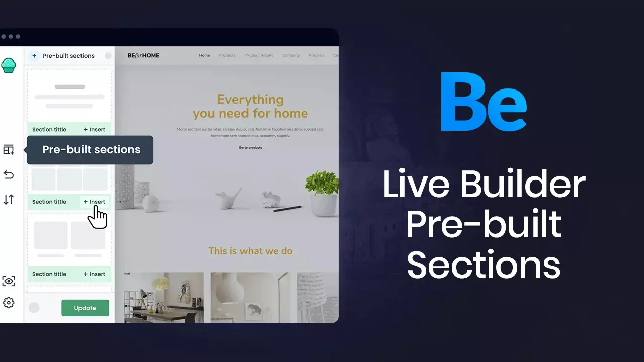
Explore our massive library of ready-made websites. Use the filters on the left to sort
your results by light and dark theme, page builder compatibility, and website type.
It can take weeks, sometimes even months to build a WordPress website from the ground up. With a BeTheme prebuilt website, you’ll have a fully loaded website up and running in under a minute. And after a couple hours of customization, you’ll have a website that’s ready for launch.
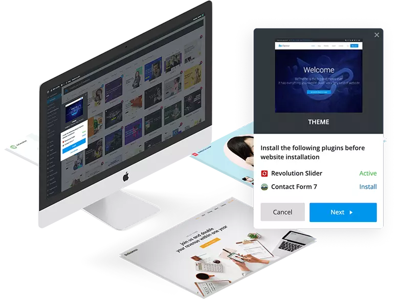
See for yourself how easy it is to import a prebuilt website into WordPress.
Available only on 
All prebuilt websites are included in a one single theme

Better than ever, faster than any other website builder for WordPress!
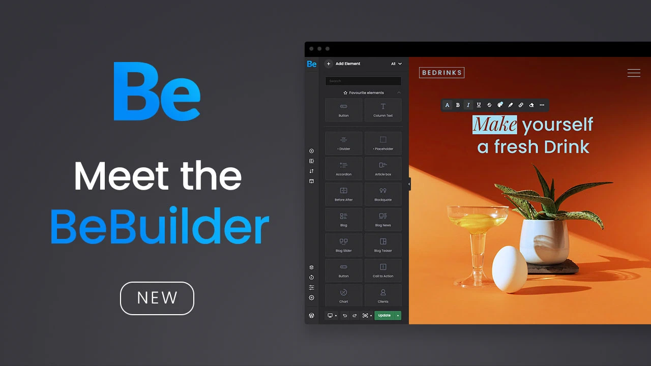
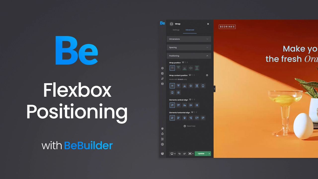
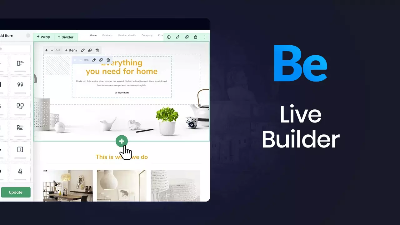
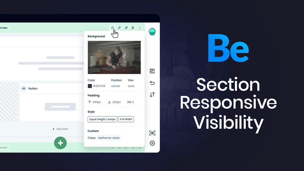
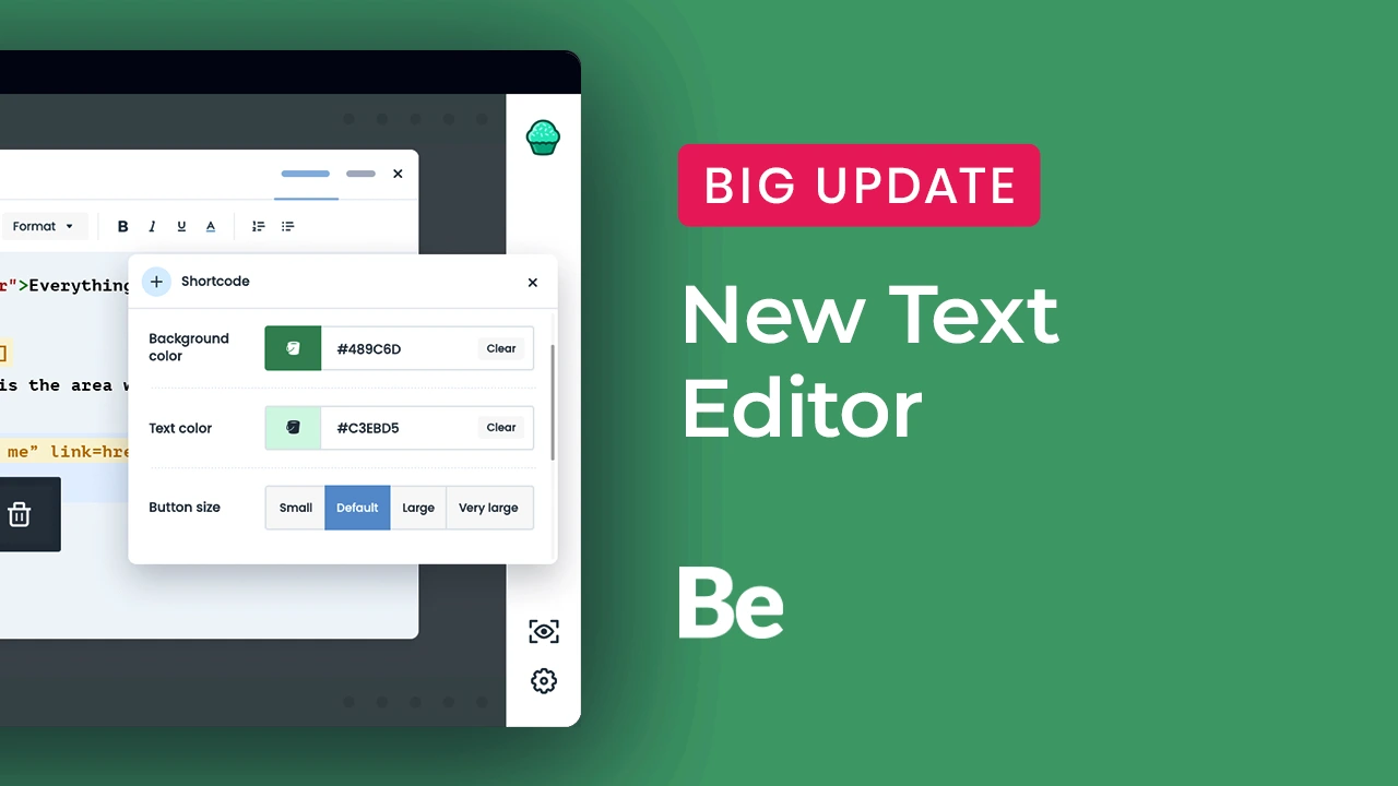
The BeBuilder has been completely rewritten with Vanilla JS. Thanks to this, the code is much lighter and the content created in it, loads in the blink of an eye. No other website builder has ever been so fast and stable.


in the v27.0
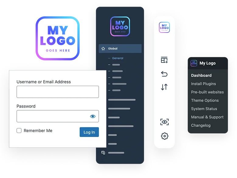
You can install prebuilt websites even more or create new project from scratch by defining things like logos, colors, fonts, etc during the installation process.
“You made it so simple! The new Setup Wizard is a game changer! Love it <3”

Our clients are the most important to us, that's why we listen to their suggestions. This is why Be is even better every day.
See all testimonials8604
Average rating 5 / 5
The product's capabilities are enormous. The following list is only a small part of what the Betheme can really do. Trust us, this is just the beginning!
Available only on 
All prebuilt websites are included in a one single theme
$174
Save money with already included plugins

Alternative builder
Save $64

Awesome Slider
Save $85

Slider add-on
Save $25

Discussion forums

Online communities

Contact forms

Page Builder

Marketing platform

Calendar plugin
Website performance

eCommerce platform
SEO tool
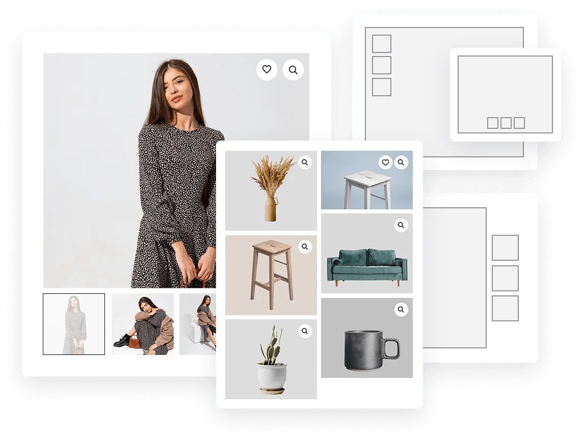
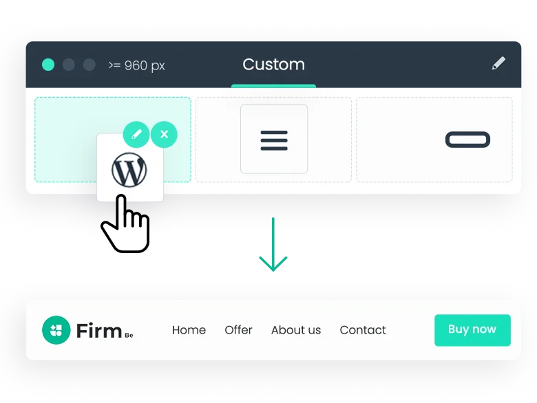
Choose between many built-in layouts for Blog, Portfolio & Shop pages. Pixel perfect design available on demand.
Read more about layouts7
8
4

2-4 columns

1 column

2-4 columns

2-4 columns

1 column

1-3 columns

1 column
Our customers appreciated us in particular for the fact that we constantly listen to their needs. Such a large number of customers cannot be wrong.
250,000+
Available only on 
All pre-built websites are included in a one single theme
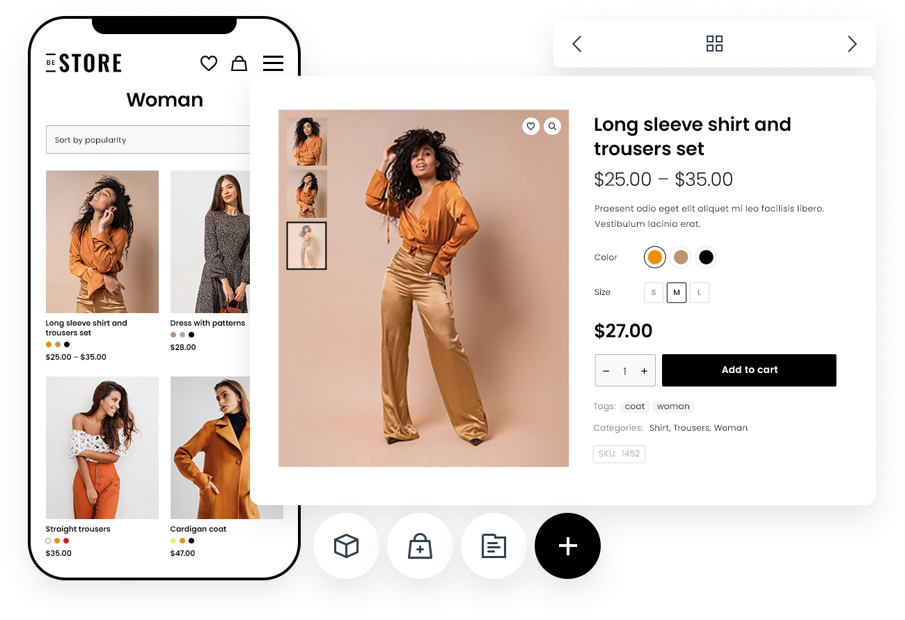
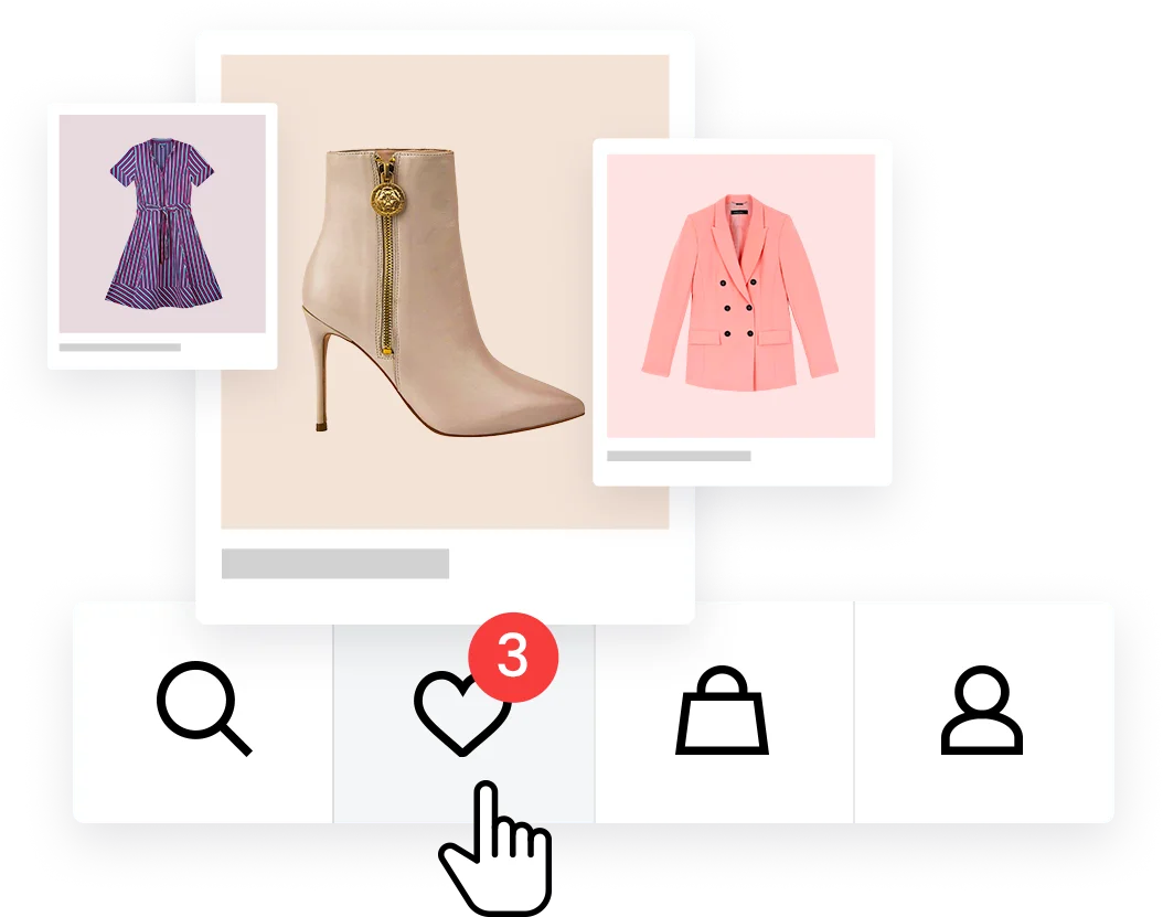
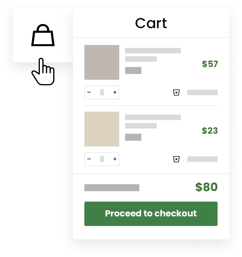
Creating a store is at your fingertips. Easier, simpler and more fun than ever before. Design versatile Shop & Single Product layouts that sell.
Have a problem? Let us help you solve it!


The average response time is only 6 hours

Now you can build websites quickly without learning any coding, whatsoever. And the best part is, you can also get your creative juices flowing with our prebuilt templates that you get with the entire package.
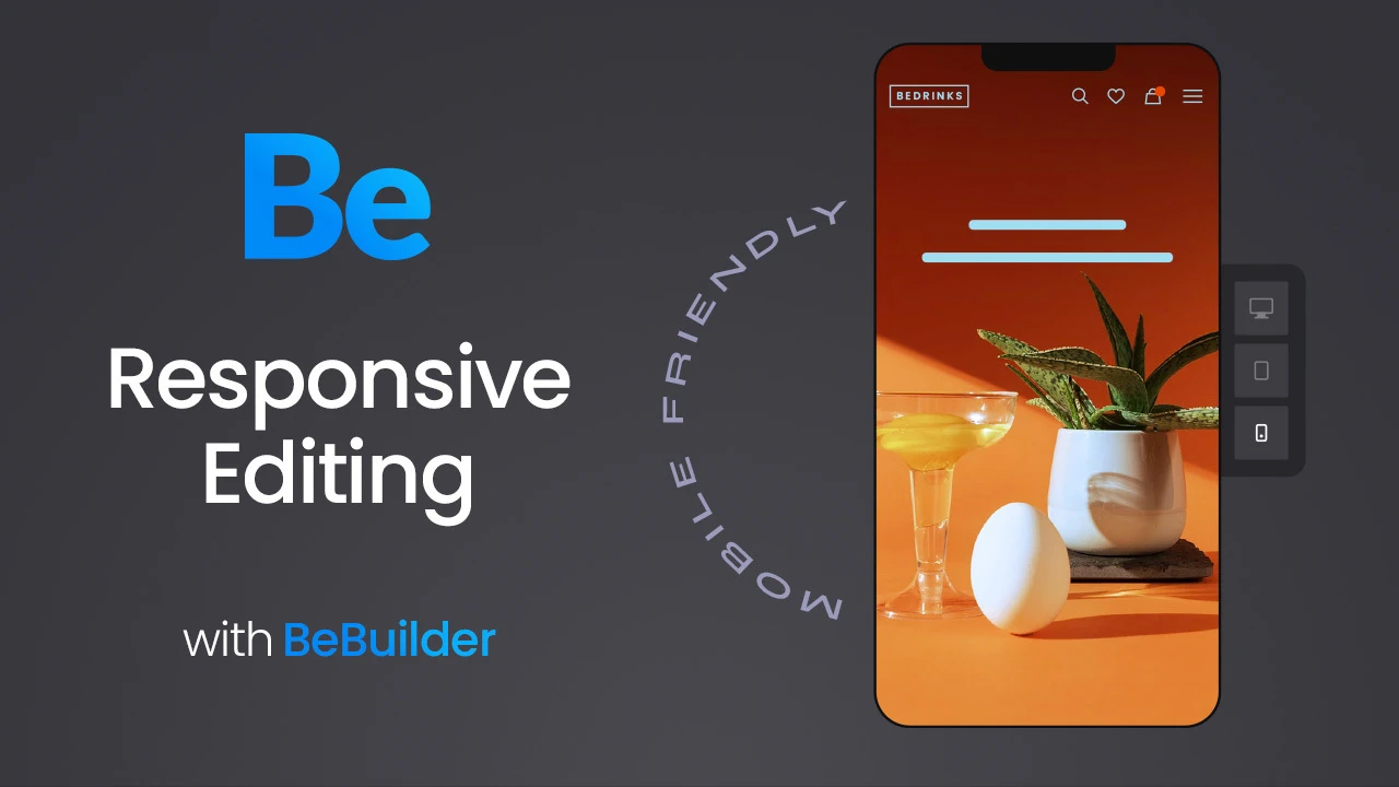
You’ve got the coding superpower to support you - so you can use more advanced features in our BeBuilder and build responsive websites in an instant.


We know you’re busy - that’s why we have included a perfectly organized toolbar and one-click import of prebuilt pages so you can design a website within a few hours without needing any technical experience.
The license can be purchased exclusively through Envato Market (Themeforest) ONLY. Please remember that this is the only place where you will receive a fully functioning and safe product legally.
With the purchase, you will get the Betheme with over 700 prebuilt websites, bundled plugins and built in-house extra add-ons. What you also get is free lifetime updates (including all future prebuilt websites). 6 months of free support also comes with the purchase therefore you don't have to worry about anything if you encounter any obstacles.
No, absolutely not. Betheme is one time purchase with lifetime updates and 6 months of support at no extra costs.
Yes, indeed! All current and future prebuilt websites comes with a single purchase.
There are several possibilities. You can contact us both in the support forum or open a private ticket. However, we recommend that you start your adventure with Be from the Support Center.
Betheme is one of the most popular WordPress Themes in the world with hundreds of thousands of satisfied customers. The product has been continuously developed since 2014, both among private users and web developers or agencies. We constantly listen to our clients' suggestions, thanks to which Be can be even better every day. All developement and support are managed by a team of experienced professionals who love what they do.
Buy and install with just 1 click
Create any website in no time
Available only on
All pre-built websites are included in a one single theme


 Default
 Default Store 2
 Default Store
 Eco Food 3
 Hotel 6
 Gadget
 Charity 4
 Baby Shop 2
 Sushi 3
 Party 5
 Politics 3
 Software 2
 Consultant 3
 AI 2
AI 2 Architect 6
 Ski 3
Ski 3 Barbeque
 Bistro 5
 Leasing 2
 Wedding Car
 Business 7
 Lingerie
 Eco 4
Eco 4 Furniture Store 2
 Agency 8
 Recipes 3
 Cosmetics 3
 Wedding 3
 Estate 4
 Burger 3
 Clothing Store 2
 Doctor
 Business 6
 Biker 4
 VR
VR Furniture Store
 Marketing 2
 Car Wash 3
 Renovate 5
 Language 4
 Pregnancy
 Jeweler 2
 Coaching 3
 Lottie
 Accountant 4
 IT Service 6
 Personal Trainer 3
 Food Truck 2
 Car Rental 3
 Business 5
 Blogger 4
 Landing 4
 Event 8
 Whiskey 2
 Agency 7
 Book 2
 Tire
Tire Eco Food 2
 Shop Assistant
 Design 4
 Wallet 2
 Baby Shop
 Event 7
 Cottage 3
 Franchise
 Diet Shop
 Agency 6
 Nursing Home
 Dentist 4
 Event 6
 Clothing Store
 Business 4
 Church 3
 Flower 2
 Consultant 2
 Cottage 2
 eBook 3
 Interior 6
 Tea 4
Tea 4 Mechanic 7
 Surfing 2
 Hemp
Hemp Coworking
 Pizza 5
 Baker 3
 Dietitian 3
 IT Service 5
 Webmaster 2
 Internet 3
 Cleaner 3
 History
 Funfair
 Barber 4
 Farm 2
 Industry 2
 Photography 3
 Print 4
 Kindergarten 4
 Finance 4
 Party 4


